Saturday, January 12, 2019

Oil Studies #2 – Color and Glazing


Oil Studies #2 – Color and Glazing

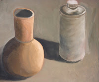
What? / The Challenge: Instead of physically mixing the final colors as they appear in your still-life set-up, in this technique we build layers of the component colors using the more transparent pigments. You need to analyze not just the local color of your object and background but the tonal color. How would you make the well-lit areas? How would you make the color you need for the shaded areas? Then lay down each component color in successive colors building to the final color. At the very end you may use a little white for shine or extreme highlight.

Why? / Goals: Through this study you will learn through experience the technique of “glazing” (where painters build colors through successive layers) in order to create a greater sense of depth in the picture plane. You will also learn from experience about the nature of the specific paint pigments we have available to us in the studio. Each pigment will have its own characteristics. You will find that some are more transparent and lend themselves to this technique whereas others can be more opaque, and tend to cover up rather than layer. You should also become aware of the different “tinting strength” of our pigments. Tinting strength refers to how powerful one pigment is compared to another. A little bit of Pthalo Green is much more powerful than a big dollop of cadmium yellow. Painters need to have this knowledge of their pigments in the way chefs need to know about the flavor of their spices.

Then what?: You will most likely find this knowledge and these techniques useful (if not actually essential) as you develop the next painting project where the objects and environments become more complex.

Process: Start out with thin layers of one of the component colors of the final tonal color for on area of your composition. Maybe some green for a shadow area of a red object, maybe some yellow for a highlight area of a green. As each layer dries, build on top with more of the component colors needed to achieve your final appearance. You may use slightly thicker and thicker layers as you go.  At the end you may use some white to get the highlights and shine to “pop”.

Time Frame: About a week of classes.

Oil Study Glazing Success Rubric
Value
Concept 5%
Design 10%
Use of Media 85%
Amazing
There is an obvious attempt to chose objects and arrange them in their environment to add interest or personal significance even though this is just a study.
The objects are arranged in the scene to create a sense of space with lighting that creates some dramatic light and shade in order to address the challenge with this technique. The background fabric has some challenging wrinkles.
Many successive layers of transparent pigments are used to not only build the subtle differences in tonal color of the objects but create, as well, a sense of depth in shadow and emphasize the form of the objects.
Ok
Objects and their background are chosen to address the challenge present.
The objects are placed side by side and the lighting is somewhat uniform. There are not many wrinkles in the background fabric.
There is some obvious attempt to build layers of colors but still arrive at more local colors rather than the subtle tonal colors of the objects.
Poor
Objects chosen don’t really allow for much opportunity to address this specific challenge.
Objects and background are merely shapes with little development of form and space.
Color layers are opaque with little sense of the transparent effects sought in this challenge.


Oil Painting Study #1 Imprimatura & Grisaille Techniques


Oil Painting Study #1   Imprimatura & Grisaille Techniques

What? / The Challenge: 
    Using the techniques described during the in-class demonstration complete one study beginning with the burnt sienna "wipe-out method" (or imprimatura) to establish the initial tonal composition of your painting based on the simple still-life set-up you created. 
    On the second day, build the second layer, further developing the light and shade and form of your objects and background using the grisaille method (a palette consisting of ultramarine blue, burn sienna and titanium white).
Why? / Goals: 
    Through this first study you will learn the basics of working with oil paint in our studio.
    You will gain some familiarity with the use of turpentine and other materials and techniques specific to oil painting. 
    You will learn one of the ways in which artists construct traditional oil paintings. Enabling you to work from the most general information with the most minimal of tools (one brush and rag) into somewhat more refined use of more colors and brushes bringing about more of a sense of chiaroscuro (dramatic light and shade). 
    This study will draw on and reinforce the observational skills we began to develop with our "5 Grays" painting. 
Then What?: This will, most likely, provide you with an strategy for approaching much more complex paintings in the near future. Painters need to have at least a couple of strategies in their toolbox for approaching paintings.


Time Frame: Three or four class periods

Friday, November 30, 2018

Impressionism and Pointillism


Impressionism and Pointillism
 

Essential Question:

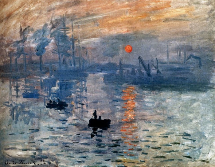
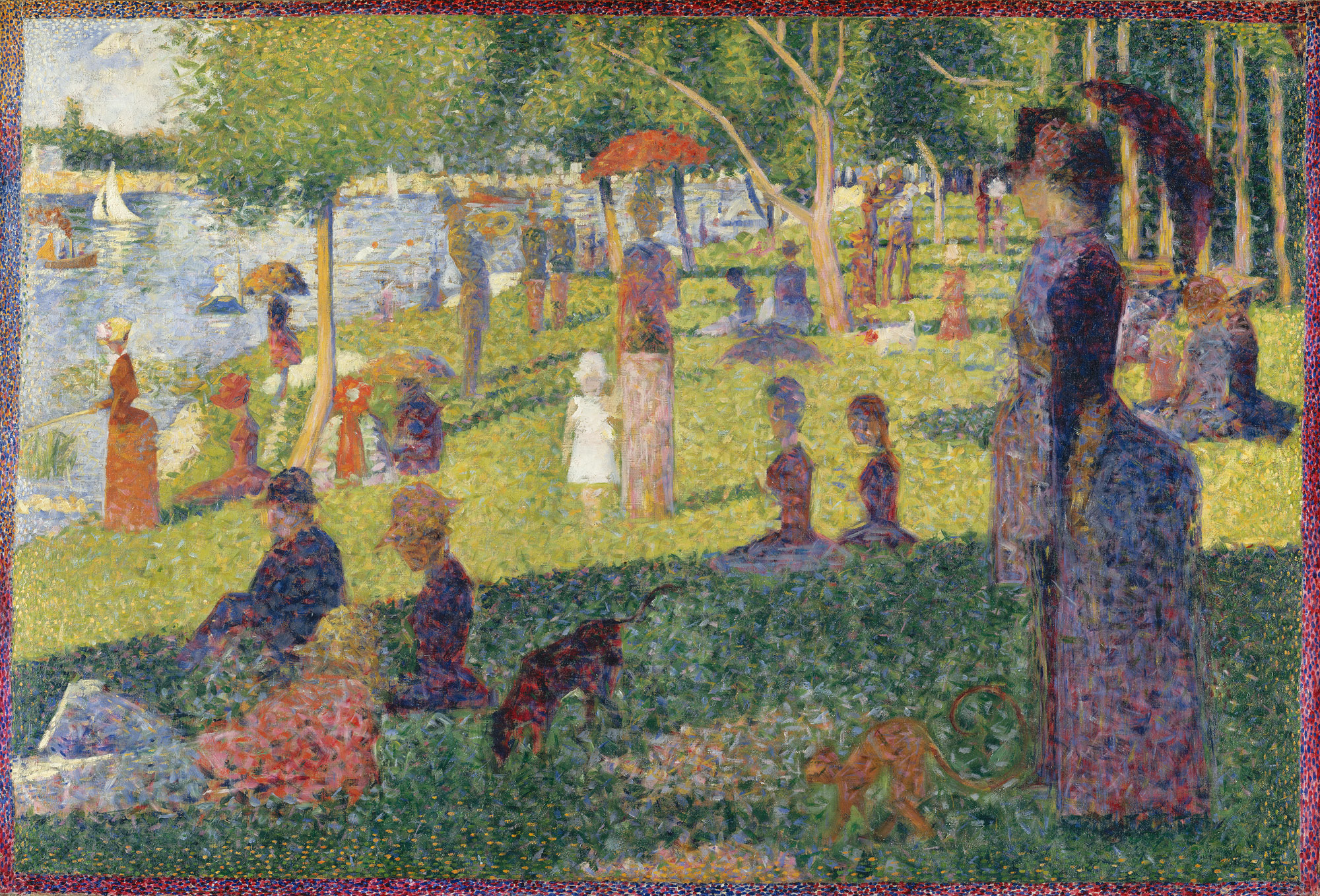
·      Can you use some of the work of the impressionists and pointillists and their investigations into the nature light, color and human vision to create your own landscape?
·      Will you be able to write a short paragraph to be used in the exhibition of your work explaining what aspect of these historical styles you used?

Goals of project:

·      expand on our study of color theory
·      explore the use of these techniques with acrylic paint.
·      developing an understanding of the art movements at the beginning of the “modern era” in Western visual art.

Process:

·      You must research the art movements of impressionism and pointillism (maybe even “divisionism”) so that you can fully understand these methods.  You may choose one of those methods that appeals to you.
·      You will take a series of photographs from your own environment either at home or here at school. In this way we are expanding on the impressionists use of the invention of the paint tube.
·      You will do a few studies to familiarize yourself with how you might develop the colors and textures of your scene with acrylic paint.
·      Develop your larger final work on illustration board or canvas.
·      Write a paragraph about how your image has been an exploration of specific concepts and artists’ work from the impressionism and pointillism movements.

Wednesday, November 21, 2018

Positive Negative Space


2D Foundation: Positive/Negative Space Painting

Goals:
·      Develop the ability to “see” both positive and negative shapes.
·      Develop an understanding of the spatial effects of color (how color behaves in three-dimensional space.
·      Create an abstract painting based on the chair still life by emphasizing the negative spaces more than the positive spaces in the composition.

Process:
Step 1: Develop an outline drawing based on a segment of the chair still-life in the classroom. Draw lightly with pencil. Concentrate on seeing the shapes created by the negative spaces as well as the positive spaces of the chairs. Try to develop an interesting composition by focusing on an area of the still-life with a good variety of small and large shapes, simple and complex shapes, straight and curving shapes.

Step 2: Then, paint in the shapes with tempera paint choosing colors that will contradict the figure/ground - positive/negative space relationship of the real still-life. Use what was discussed in the class demonstration about the spatial effects of color to aid your choice of colors and color scheme.
·      Warm colors tend to advance when compared to cool colors.
·      Pure colors tend to advance when compare with neutralized colors.
·      Light value colors tend to advance when compared to darker valued colors.
Mix your colors well and paint carefully as the most successful projects will contain solid hard-edged shapes of color that will appear to float in space.

Materials: Tempera paint. Time Frame: approximately 5 class periods.

Thursday, November 1, 2018

Color Theory Abstraction

Color Theory is the term artists use to describe the relationships of color, how colors are mixed, and how colors behave. With these understandings, artist are able to use color in support of the ideas behind their work. Through this project we learned some basic color relationships and how artists use them to organize a palette of colors for a given work. Given a pattern of random shapes created by the directed line instructions in class you are to choose one of these limited palettes and maximize the possibilities in adding color to your abstract design. 

Color Strategies:
Mono-chromatic Color: The use of a single pure hue (pure unmixed pigment color) and variations made by adding white (tints), black (shades) or bits of its compliment (semi-neutrals).

Analogous Color: Related colors, whose relationship is based on a single shared primary color. 

Complementary Color: Colors that are opposite on the color wheel. Usually the contrast of a primary against the combination of the other two primaries. When mixed, complementary colors neutralize each other. When placed next to each other the intensify each other creating a jarring relationship.

Triadic Color: A triadic color scheme uses colors that are evenly spaced around the color wheel. Triadic color harmonies tend to be quite vibrant, even if you use pale or unsaturated versions of your hues
3, 4, 5 Triad
 A variation on the triad scheme but skewed towards one area of the color wheel. This is a little less predictable, and more interesting than a regular triadic scheme. Two of your colors are closer together than the other producing dominance in one area of the color wheel.

Split-Complementary 
The split-complementary color scheme is a variation of the complementary color scheme. In addition to the base color, it uses the two colors adjacent to its complement.